Guest Pay
Guest Pay
Guest Pay
Making the path to payment obvious.
Making the path to payment obvious.
Making the path to payment obvious.

Project Snapshot
Role
Role
Lead UX Designer
Lead UX Designer
Time Frame
Time Frame
January–March 2025
January–March 2025
Scope
Scope
Brand
Product
Design Systems
Brand
Product
Design Systems
Impact
Impact
18% increase in
online payments
18% increase in
online payments
Overview
A new guest payment experience designed from the ground up to help members pay their medical bills anytime, anywhere, without creating an account or navigating through an insurance portal. This 0 → 1 project introduced a direct, standalone path for locating a bill, entering payment details, and confirming the transaction. As a standalone external platform, Guest Pay was designed across desktop, tablet, and mobile to support a seamless checkout experience on the go.
A new guest payment experience designed from the ground up to help members pay their medical bills anytime, anywhere, without creating an account or navigating through an insurance portal. This 0 → 1 project introduced a direct, standalone path for locating a bill, entering payment details, and confirming the transaction. As a standalone external platform, Guest Pay was designed across desktop, tablet, and mobile to support a seamless checkout experience on the go.
The Problem
Paying a bill shouldn't require an account. Before Guest Pay, members had to navigate their insurance portal, find their bill, and work through a bloated experience just to make a payment. For members without credentials, the path was even harder. They could get lost. They could forget their login. Or they could abandon the payment altogether. The opportunity was straightforward:
Paying a bill shouldn't require an account. Before Guest Pay, members had to navigate their insurance portal, find their bill, and work through a bloated experience just to make a payment. For members without credentials, the path was even harder. They could get lost. They could forget their login. Or they could abandon the payment altogether. The opportunity was straightforward:
Provide members a direct path to what they came to accomplish.
Provide members a direct path to what they came to accomplish.


Members were often frustrated with the process of paying their bills online as they needed to navigate to a homepage, locate the login button, be rerouted to a portal login and remember their healthcare credentials.
"I usually pay my medical bills over the phone because paying online is too much of a hassle."
"I usually pay my medical bills over the phone because paying online is too much of a hassle."
Starting with Intent
Since members were trying to pay a medical bill and not manage their healthcare, I focused the experience around the user's immediate goal of find the right bill, make a payment, and get confirmation it went through. Rather than recreating the complexity of the existing member portal, I designed Guest Pay as it own experience as a sort of check out flow.
Since members were trying to pay a medical bill and not manage their healthcare, I focused the experience around the user's immediate goal of find the right bill, make a payment, and get confirmation it went through. Rather than recreating the complexity of the existing member portal, I designed Guest Pay as it own experience as a sort of check out flow.
Find bills
→
Select payment details
→
Enter payment info
→
Verify & pay
→
Confirm
Find bills
→
Select payment details
→
Enter payment info
→
Verify & pay
→
Confirm
This simple flow became the foundation for the experience.
Finding the Right Bill
The first challenge was identification. Without requiring a login, users needed a secure way to locate the bill they wanted to pay. We solved this on the landing page by asking for a unique identifier, such as an invoice number, bill account number, or member ID. This was information readily available on their invoice or insurance card.
The first challenge was identification. Without requiring a login, users needed a secure way to locate the bill they wanted to pay. We solved this on the landing page by asking for a unique identifier, such as an invoice number, bill account number, or member ID. This was information readily available on their invoice or insurance card.
The goal was to make this first step feel less like authentication and more like simply entering information they already had at hand.
The goal was to make this first step feel less like authentication and more like simply entering information they already had at hand.


Designing for the Transaction
Once a bill was found, the experience needed to keep users moving. I introduced a stepper to establish where users were in the payment process and structured the forms around the information they actually needed to provide.
Once a bill was found, the experience needed to keep users moving. I introduced a stepper to establish where users were in the payment process and structured the forms around the information they actually needed to provide.
Select account(s)*
Dental Premium
Bill Account Number
005987654321D000
Invoice Number
220916333611(C)
Due Date
06/01/2025
Amount Due
$288.00
Vision Basic
Bill Account Number
005987654321D000
Invoice Number
220916444422(C)
Due Date
06/01/2025
Amount Due
$150.00
Health Standard
Bill Account Number
005456789012D000
Invoice Number
220916555533(C)
Due Date
06/01/2025
Amount Due
$410.00
Users were presented initial payment decisions the as simple, selectable tiles rather than forcing users to parse dense form content.
Users were presented initial payment decisions the as simple, selectable tiles rather than forcing users to parse dense form content.


Payer information and payment information were separated into clear sections, creating a stronger hierarchy and reducing the amount of information users had to process at once.
Payer information and payment information were separated into clear sections, creating a stronger hierarchy and reducing the amount of information users had to process at once.


Ensuring Pixel Fidelity
Since Guest Pay was built from scratch, there was a lot of clarity I needed to provide to the developers. There was never a true handoff. Instead, the process relied on continuous demos, screen annotations, and implementation reviews to ensure the new experience stayed aligned with the intended user journey.
Since Guest Pay was built from scratch, there was a lot of clarity I needed to provide to the developers. There was never a true handoff. Instead, the process relied on continuous demos, screen annotations, and implementation reviews to ensure the new experience stayed aligned with the intended user journey.

Annotations
I used screen annotations to call out the details that could easily be missed during implementation, including component behavior, responsive states and interaction requirements. These annotations gave the developer a reference for how each screen should look and behave, reducing ambiguity and helping the implementation stay visually consistent with the designs.
I used screen annotations to call out the details that could easily be missed during implementation, including component behavior, responsive states and interaction requirements. These annotations gave the developer a reference for how each screen should look and behave, reducing ambiguity and helping the implementation stay visually consistent with the designs.

Implementation Reports
I also created a UI implementation report to compare the built experience against the approved designs. The report documented visual differences, identified areas that needed refinement, and provided specific feedback for bringing the implementation closer to the intended design.
I also created a UI implementation report to compare the built experience against the approved designs. The report documented visual differences, identified areas that needed refinement, and provided specific feedback for bringing the implementation closer to the intended design.
The New Experience
The result was a focused payment journey that removed the need to navigate through a member portal just to complete a single transaction.
The result was a focused payment journey that removed the need to navigate through a member portal just to complete a single transaction.
With the interaction and visual details refined to pixel-level fidelity, the final flow makes each step feel clear and intentional. From bill lookup through confirmation and summary, the experience stays focused on one question:
With the interaction and visual details refined to pixel-level fidelity, the final flow makes each step feel clear and intentional. From bill lookup through confirmation and summary, the experience stays focused on one question:
What does the user need to know or do right now?
What does the user need to know or do right now?
Measuring Good Design
18%
Increase in online payments
Guest Pay created a simpler path to one of the most common healthcare transactions: paying a bill.
Guest Pay created a simpler path to one of the most common healthcare transactions: paying a bill.
By removing the requirement to navigate a member portal and designing the experience around the user's immediate intent, the redesigned flow helped more people complete their payment online.
By removing the requirement to navigate a member portal and designing the experience around the user's immediate intent, the redesigned flow helped more people complete their payment online.
Final Thoughts
Don't make people learn the system. Instead, design around what they came to do. Guest Pay reinforced a philosophy I carry into every product I design: people should not have to understand complex systems in order to complete a straightforward task. The existing experience reflected users were expected to have a understanding of the digital member ecosystem. Guest Pay started with a different question: What is the person trying to accomplish right now, and what is the minimum information they need to get there?
Don't make people learn the system. Instead, design around what they came to do. Guest Pay reinforced a philosophy I carry into every product I design: people should not have to understand complex systems in order to complete a straightforward task. The existing experience reflected users were expected to have a understanding of the digital member ecosystem. Guest Pay started with a different question: What is the person trying to accomplish right now, and what is the minimum information they need to get there?
For me, that meant designing a product that translated complicated systems into clear next steps. The product absorbed the complexity, established the right sequence, and gave members enough context to move forward with confidence. Users should be able to complete what they came to do without first learning how the larger system works.
For me, that meant designing a product that translated complicated systems into clear next steps. The product absorbed the complexity, established the right sequence, and gave members enough context to move forward with confidence. Users should be able to complete what they came to do without first learning how the larger system works.
Want to
Then
talk about a project?
collaborate on something?
solve a design problem?
elevate your product?
reach out below!
What Has My Attention

Focuses on the multiplier skills in UX, not just the essentials.

Shares how designers think, work, and evolve. Hosted by Ridd.
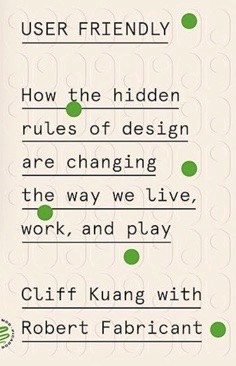
Learn how design has shaped modern life, behavior, and society.

Exploration of product design, tech, tools, and trends in the AI era.
Built & designed by me (with some help from Claude and GPT)
Portfolio V1.3
Want to
Then
talk about a project?
collaborate on something?
solve a design problem?
elevate your product?
reach out below!
What Has My Attention
Focuses on the multiplier skills in UX, not just the essentials.
Shares how designers think, work, and evolve. Hosted by Ridd.
Learn how design has shaped modern life, behavior, and society.
Exploration of product design, tech, tools, and trends in the AI era.
Built & designed by me (with some help from Claude and GPT)
Portfolio V1.3
Want to
Then
talk about a project?
collaborate on something?
solve a design problem?
elevate your product?
reach out below!
What Has My Attention
Focuses on the multiplier skills in UX, not just the essentials.
Shares how designers think, work, and evolve. Hosted by Ridd.
Learn how design has shaped modern life, behavior, and society.
Exploration of product design, tech, tools, and trends in the AI era.
Built & designed by me (with some help from Claude and GPT)
Portfolio V1.3
Want to
Then
talk about a project?
collaborate on something?
solve a design problem?
elevate your product?
reach out below!
What Has My Attention
Focuses on the multiplier skills in UX, not just the essentials.
Shares how designers think, work, and evolve. Hosted by Ridd.
Learn how design has shaped modern life, behavior, and society.
Exploration of product design, tech, tools, and trends in the AI era.
Built & designed by me (with some help from Claude and GPT)
Portfolio V1.3
Want to
Then
talk about a project?
collaborate on something?
solve a design problem?
elevate your product?
reach out below!
What Has My Attention
Focuses on the multiplier skills in UX, not just the essentials.
Shares how designers think, work, and evolve. Hosted by Ridd.
Learn how design has shaped modern life, behavior, and society.
Exploration of product design, tech, tools, and trends in the AI era.
Built & designed by me (with some help from Claude and GPT)
Portfolio V1.3
Want to
Then
talk about a project?
collaborate on something?
solve a design problem?
elevate your product?
reach out below!
What Has My Attention
Focuses on the multiplier skills in UX, not just the essentials.
Shares how designers think, work, and evolve. Hosted by Ridd.
Learn how design has shaped modern life, behavior, and society.
Exploration of product design, tech, tools, and trends in the AI era.
Built & designed by me (with some help from Claude and GPT)
Portfolio V1.3